
Tuesday, 2 November 2010

Wednesday, 20 October 2010
My 3D Text Animation
This is my animated text. I made the animation by using the auto key and timeline. As you slide along you can change things, move letters etc. Then you can press the play button and it will work. After that the hardest part was saving (rendering), I saved this to my documents with the active time segment tool.
3D Text
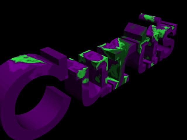


These are my 3D Text renders.
Today we made 3D text using 3D Max, first of we started by using the shapes tab, using splines. Them we used Editable Mesh. After extruding the polygones, to make it a 3D shape, we used the material tool to create our own colour styles, I used Marble, Stucco and swirl.
Comparing these with proffesional work for example this one which has many effects, it doesnt compare, but there is alot of time for me to work and develope better skills in this area.

Tuesday, 19 October 2010
My Desktop Background

Once placed on the background I imported the text called "blazed" from http://www.dafont.com/ and added the school logo. When that was finished I used some brushes to make purples lines to make it look more presentable, after that I added the 5 college regulations that we thought was most important, these of which would stand out, so the user can read them clearly. I then moved the icons (shortcuts) into places where it was easy to navigate.
 This is the text style I have used.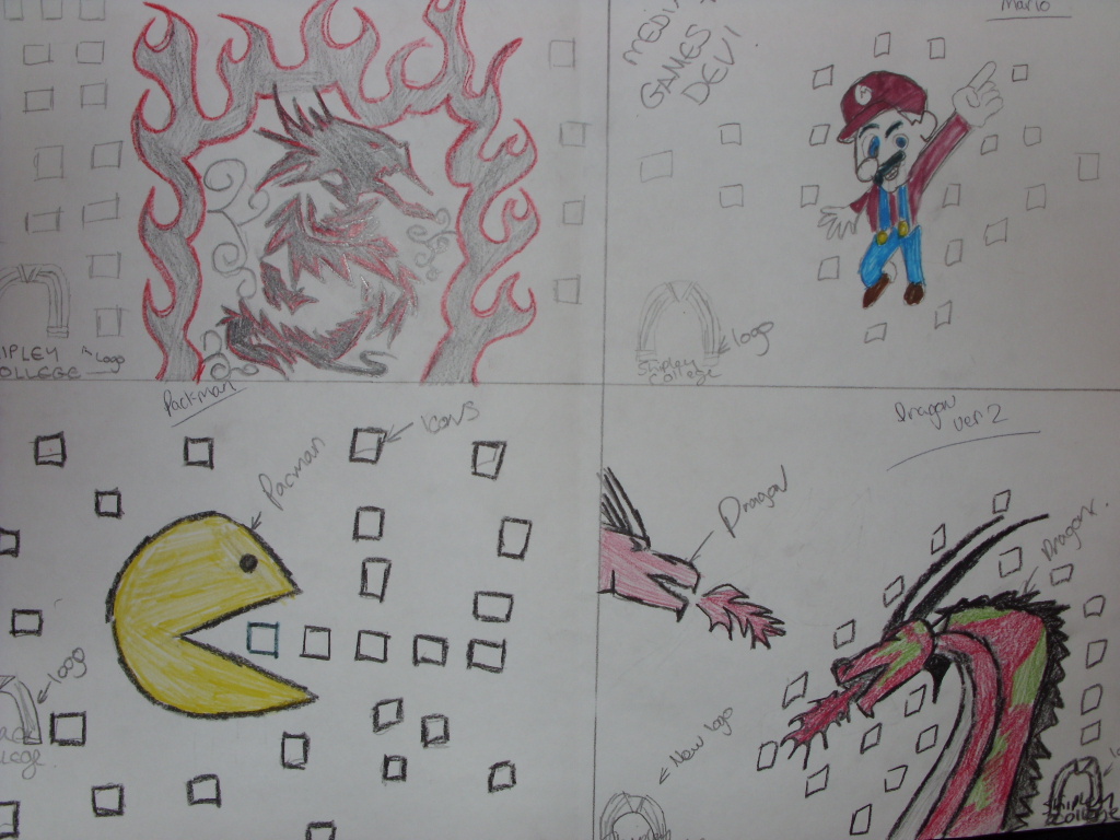
Above is my final 4 designs drawn, I chose top left. The design turned out different than expected, but I was happy with the result.
I think if i was going to remake the same image (background) I would do a few things differently
- Different Colours for the dragon
- Different textures
- Different Flame Styles
- Different logo Style

The picture on my right, is the photo I took with the camera then uploaded to photoshop. I hand drew this and it turned out how I wanted.
Wednesday, 13 October 2010

In 3D Design today, we had a tutorial on box modeling. We made a basic car which with many features from the modify tool. We used editable mesh to modify the edges, vertices's, polygons etc... When the car shapes were in place we used other modifying tools like taper / squeeze to make the car how we want it.
After developing the box model car, we used the colour modifier to make everything look realistic, as you can see I have used a blue for the body, grey for the chrome and light transparent blue for the windows.
Tuesday, 12 October 2010
PSD : What makes a logo look good.

Some other brand's logo's use different text styles, for example "KoolAid" which has a 3D effect, Castrol which has italic text and and oreo which has a highlighted text background.
Subscribe to:
Posts (Atom)