
Tuesday, 2 November 2010
Wednesday, 20 October 2010
My 3D Text Animation
This is my animated text. I made the animation by using the auto key and timeline. As you slide along you can change things, move letters etc. Then you can press the play button and it will work. After that the hardest part was saving (rendering), I saved this to my documents with the active time segment tool.
3D Text
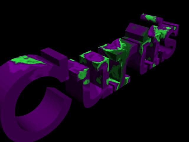


These are my 3D Text renders.
Today we made 3D text using 3D Max, first of we started by using the shapes tab, using splines. Them we used Editable Mesh. After extruding the polygones, to make it a 3D shape, we used the material tool to create our own colour styles, I used Marble, Stucco and swirl.
Comparing these with proffesional work for example this one which has many effects, it doesnt compare, but there is alot of time for me to work and develope better skills in this area.

Tuesday, 19 October 2010
My Desktop Background

Once placed on the background I imported the text called "blazed" from http://www.dafont.com/ and added the school logo. When that was finished I used some brushes to make purples lines to make it look more presentable, after that I added the 5 college regulations that we thought was most important, these of which would stand out, so the user can read them clearly. I then moved the icons (shortcuts) into places where it was easy to navigate.
 This is the text style I have used.
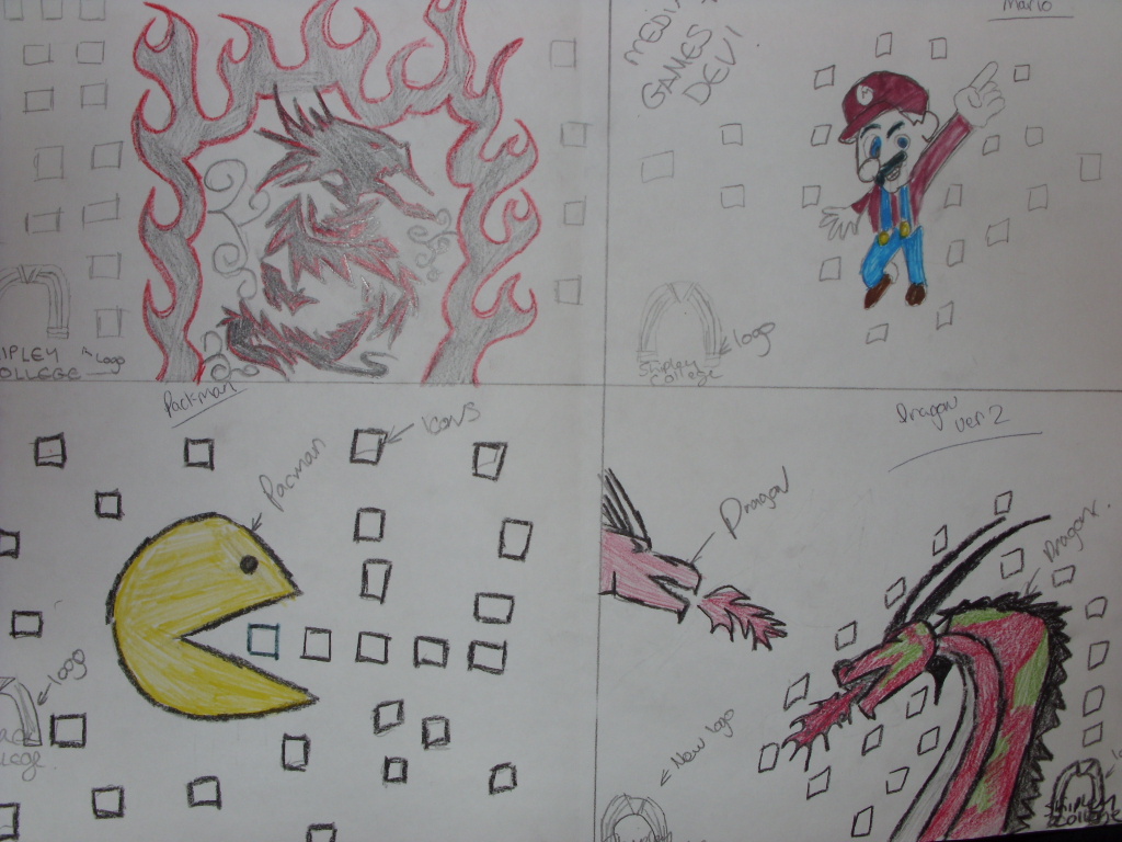
Above is my final 4 designs drawn, I chose top left. The design turned out different than expected, but I was happy with the result.
I think if i was going to remake the same image (background) I would do a few things differently
- Different Colours for the dragon
- Different textures
- Different Flame Styles
- Different logo Style

The picture on my right, is the photo I took with the camera then uploaded to photoshop. I hand drew this and it turned out how I wanted.
Wednesday, 13 October 2010

In 3D Design today, we had a tutorial on box modeling. We made a basic car which with many features from the modify tool. We used editable mesh to modify the edges, vertices's, polygons etc... When the car shapes were in place we used other modifying tools like taper / squeeze to make the car how we want it.
After developing the box model car, we used the colour modifier to make everything look realistic, as you can see I have used a blue for the body, grey for the chrome and light transparent blue for the windows.
Tuesday, 12 October 2010
PSD : What makes a logo look good.

Some other brand's logo's use different text styles, for example "KoolAid" which has a 3D effect, Castrol which has italic text and and oreo which has a highlighted text background.
Tuesday, 5 October 2010
Text Styles

Some styles that would fit my project are above. I have got the text's from http://www.dafont.com/.
The styles aboved are called ;
Beast Wars,
Bethany Style Letters,
BumRush,
Blazed.
My 4 Designs For Desktop Project.
Above is my final 4 designs hand drawn. Top Left is a stylish dragon design, surrounded by red hot flames. Most of the design colour is red and black because these colours are very distinctive to the slickness of the design. The icons and the Shipley logo will be placed around the flames. This is my favourite choice because it's very unique and stylish and will catch the eye of the user using the computer.
The top right picture is Mario, for the all time classic series from Nintendo. The basic colours are blue and red since that is the colour Mario wears. The icon and the shipley logo will be placed out side and around mario position.
Bottom left picture is the classic game "packman", this is my second favourite choice because if I added more detail it would look fantastic and original. The icons would represent the food.
Bottom right is a 2 dragons colours red and green with both dragons breathing fire, the shipley logo and icons would be places around both dragons .
Equality and Diversity Poster

Above is my Equality and Diversity poster. My poster represents who I am, where i come from and what I like to do. As you can see one of my favourite foods are kfc and subway because there easy and delicious. The reason why there is a Scotland flag is that my dads side of the family is scottish while my mothers side of the family are English. Also you can see im a big sports fan of football, my favourite team would be Manchester United and one of my hobbies is to play fifa on the ps3 with friends / online. My two favourite programms consist of "The Simpsons" and the "Inbetweeners" because they are entertaining and it's something you can watch over and over again. Finally you can see a picture of Keighley town square, this is where I have lived all my life. I have chosen the people around the world picture because I think that it is relevent and the hands in the air suggest success / equality.
Wednesday, 22 September 2010
Pingu

Pingu.
My creation in 3D max was based on pingu the penguin, i have made this using 3D Max's shapes such as pryimids, boxs and spheres etc... I have found this experiance very helpful and entertaining and would like to develop more in the futer. I have used 3 main colours orange, white and black as they are the main colours on a any penguin, real or cartoon.
Unit 66
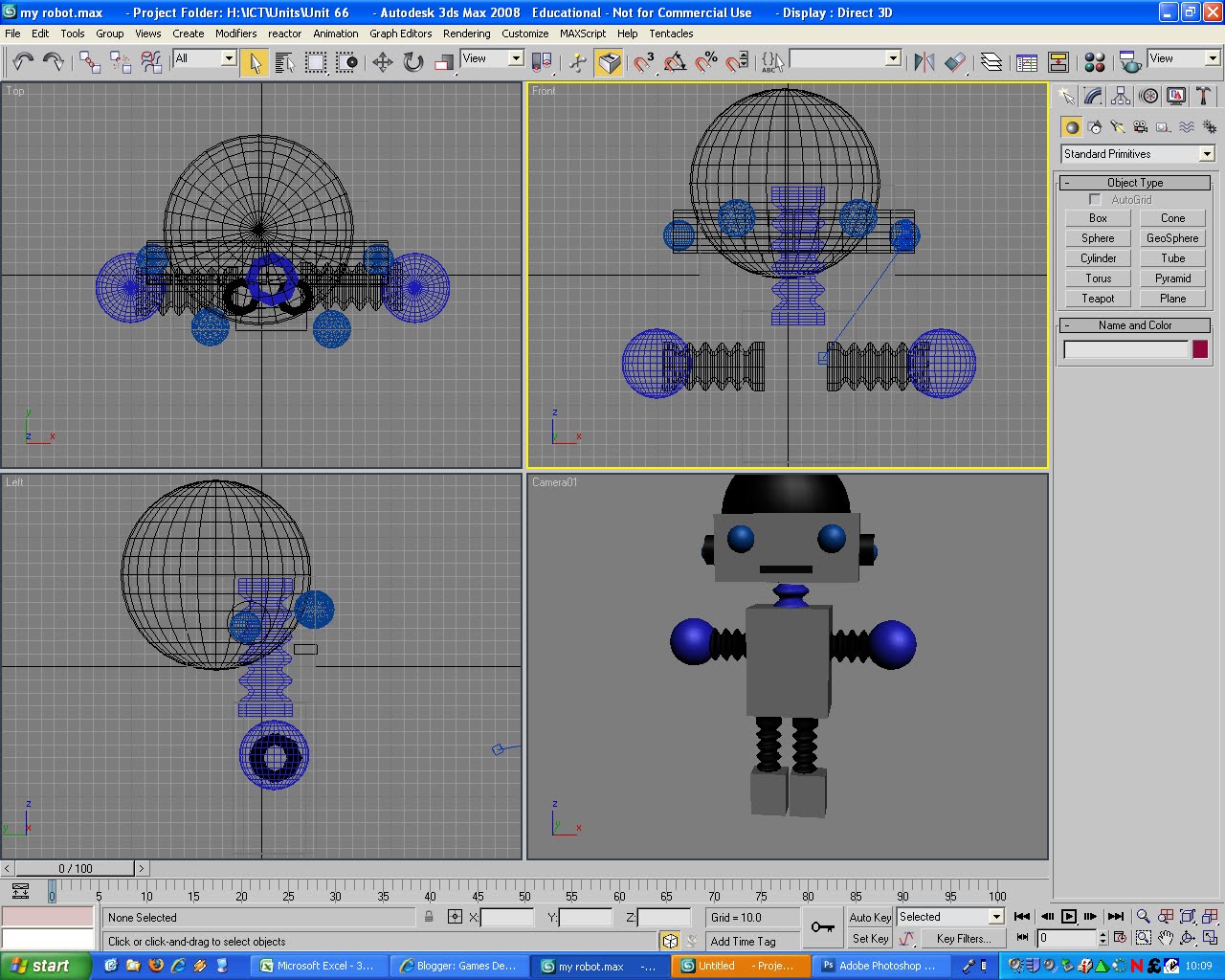
Today we used 3D studio max, our task was to learn the basics while making our own personal robot. We used many different things such as perspective shapes, for example a cylinder or a sphere.
Tuesday, 21 September 2010
Unit 19: Desktop Project

This is my project.
When we created the desktop project there were four main areas to include, the four main genres are Horror, Si-Fi, Fantasy and War.
First of all we had to cut images out of magazines of different types of genre games, which include things like Mario and Call of Duty. The purpose of this was to point out which pictures relate to which genre. It was really fun but it was hard to find some pictures as some of the magazines were already missing images.
Most of the images are widely spread out which means it is quite hard to understand, In my opinion I need to improve on this type of work and put more effort in but it's not bad for a first try.
The image source were from magazines called "edge" and other various game magazines, and some image were donate by a friend.
It took an estimated time of just under two hours and everyone developed there own ideas.
- Curtis Stoyles
Wednesday, 15 September 2010
3D Work Day 1

Personally I enjoyed my first used of the program and cannot wait to use the features more. Above is the picture of my final project.
Games Development : What I want to get out of this course.
When the course is completed I hope to get the qualifications and get a place into college or a job in the game industry, I chose this course because its something I do everyday and love, it keeps me entertained and its something I would love to do as a carrer, also the bonus of the course is that you can spent time with people who also love different types of game genres.
Subscribe to:
Comments (Atom)